Table of Contents
Users engage with a wide range of interfaces all the time in today’s digital world, from websites to mobile apps and beyond. Developing memorable and compelling user experiences requires a thorough understanding and leveraging of human behavior. Enters Behavioral UX Design. Through the alignment of design methodologies and patterns with psychological concepts and natural human behaviors, designers can create highly intuitive, engaging, and satisfying interfaces that go beyond mere functionality.
What is Behavioral UX Design?
Behavioral UX Design is a method that integrates insights from human psychology to craft user experiences that align with how people naturally think, feel, and behave. It’s about designing with the user’s mind in mind, recognizing and acknowledging the cognitive, emotional, and social factors that influence behavior and integrating these insights while designing interfaces.
In a world where the users’ expectations are higher than ever, Behavioral UX Design offers a significant advantage. By understanding and applying psychological principles, designers can create interfaces that are more than just intuitive, they become enjoyable and better yet, addictive. This approach leads to improved user satisfaction, increased engagement, and higher conversion rates, ultimately driving the success of digital products and services.
Behavioral UX Principles
While there are several behavioral UX principles that guide effective design, let’s delve deep into 10 core principles that stem from human psychology and interaction patterns that shape how users interact with digital interfaces with their applications with real-world examples.
Cognitive Load Management
Cognitive load refers to the mental effort required by the brain to process information and make decisions. When the users get overwhelmed by complex or cluttered interfaces, their performance and satisfaction deplete, leading to frustration and abandonment and increases the likelihood of errors.
Some applications of Cognitive Load Management in Interface Design:
- Simplified Navigation: Simplifying navigation is essential. This involves using clear, consistent labels, minimizing the number of choices at each level, and grouping related content together. By reducing the number of clicks or taps required to find information, users can navigate your interface effortlessly.
- Decluttering: It’s crucial to remove unnecessary elements from your interface. Every element on a screen should serve a specific purpose. This doesn’t mean stripping the interface bare, but rather focusing on the essential information and actions. Unnecessary icons, redundant elements, and decorative elements that don’t enhance usability should be avoided.
- Progressive Disclosure: Progressive disclosure is a strategy where information is revealed step by step, showing only what is necessary at each stage of the user journey. This technique helps users focus on their immediate task without being overwhelmed by too much information at once.
Real-Life Example:
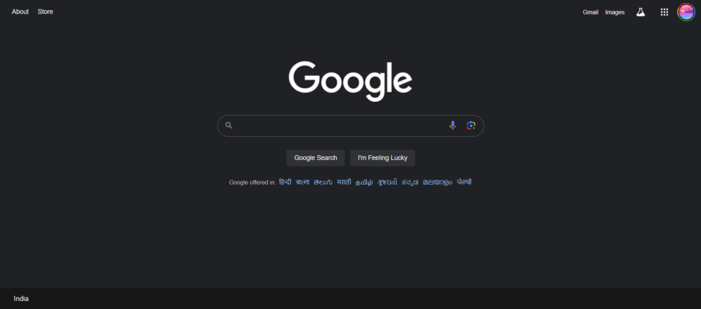
Google’s homepage exemplifies cognitive load management. Its minimalistic design focuses the user’s attention on the search bar, reducing distractions and making the primary task of searching its focal point.
Habit Formation
Habit formation is the process by which certain behaviors become automatic through repetitive action. In UX, designing for habit formation can lead to increased user engagement, retention and long-term loyalty, as users repeatedly return by incorporating the product in their daily routine without the need for conscious effort.
Some applications of Habit Formation in Interface Design:
- Consistency: Placing the key elements, such as navigation menus or action buttons, in the same location across the interface is crucial for habit formation. Consistency helps users develop muscle memory, making repeated actions feel effortless and natural.
- Reminders: Regular reminders can help users keep up their habits. Notifications that prompt users to return to an app or continue a task play a crucial role in keeping the behavior top of mind until it becomes a habit.
Real-Life Example:
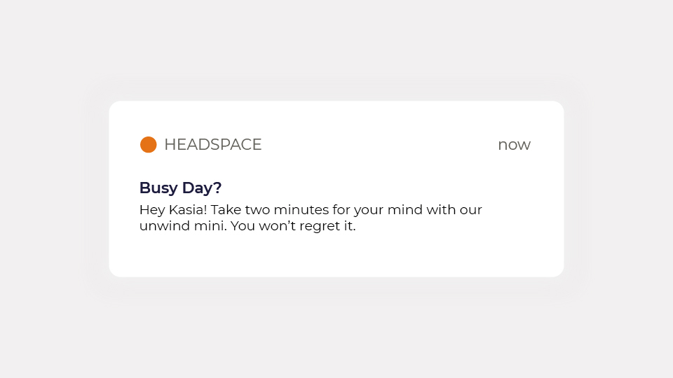
Headspace supports habit formation with daily meditation reminders and progress tracking. The app encourages users to build a regular meditation routine by setting achievable goals and providing daily notifications.
User Motivation
User motivation, driven by intrinsic (internal satisfaction) and extrinsic (external rewards) factors, plays a crucial role in shaping user engagement. Motivated users are more likely to engage deeply with a product and commit to long-term use.
Some applications of User Motivation in Interface Design:
- Goal Setting: Allowing users to set and track personal goals provides them with a clear path for achievement. This sense of progression taps into intrinsic motivation, as users feel a sense of accomplishment as they reach milestones.
- Rewards and Incentives: Offering tangible rewards (such as discounts or badges) or intangible ones (like praise or recognition) can motivate users to continue using a product. These rewards create a positive feedback loop, encouraging repeated use of a product.
- Feedback on Progress: Providing users with regular feedback on their progress, such as progress bars or achievement notifications gives the users a positive nudge. Knowing how close they are to reaching a goal keeps users engaged and committed.
Real-Life Example:
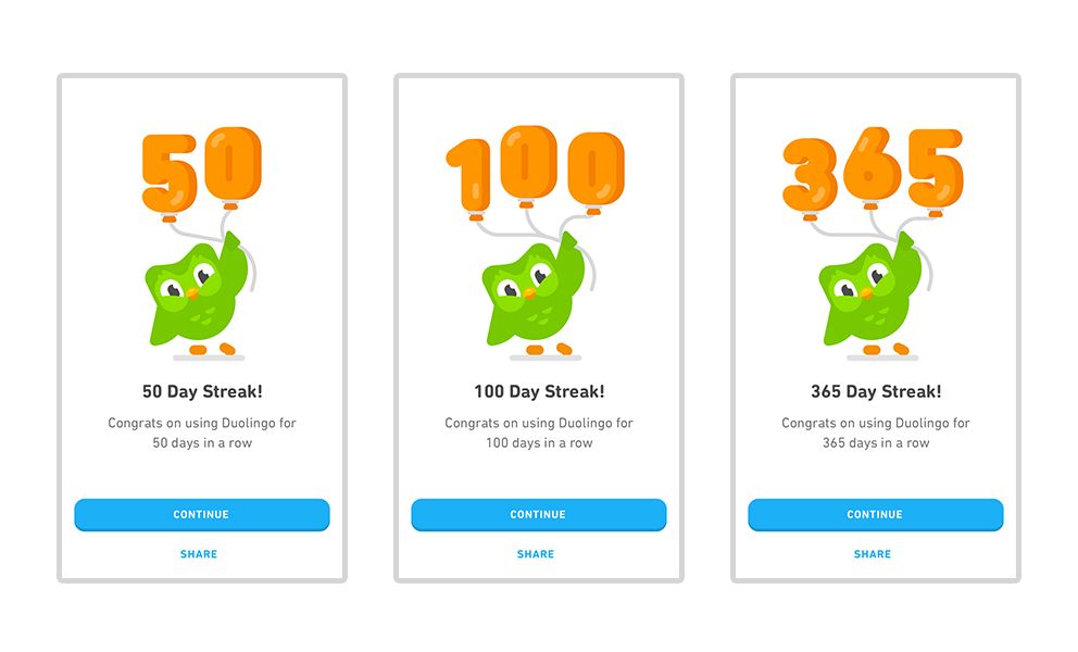
Duolingo’s language learning app uses streaks and rewards to motivate users. The app tracks consecutive days of use, encouraging users to maintain their streak and continue learning.
Emotional Design
Emotional design focuses on creating interfaces that evoke positive emotions, Emotional design goes beyond usability as it strengthens the user’s connection to the product, fostering loyalty and a deeper emotional investment in the brand. Users are more likely to return to and recommend products that evoke positive emotions.
Some applications of Emotional Design in Interface Design:
- Color Psychology: Colors have a profound impact on emotions. For example, warm colors like red and orange can create a sense of excitement or urgency, while cool colors like blue and green can convey calmness or trust. By strategically using color, designers can influence the emotional response of users.
- Typography: The choice of fonts can evoke different emotions and perceptions. For instance, a luxury brand might use elegant, serif fonts to convey sophistication, while a playful brand might use rounded, sans-serif fonts to create a sense of fun and approachability.
- Micro-Interactions: Subtle animations and interactions, such as a button changing color when hovered over or a playful loading animation, can surprise and delight users. These small touches add a layer of emotional engagement that can make the user experience more enjoyable.
Real-Life Example:
Apple is known for its emotional design, from the sleek lines of its hardware to the fluid animations in its software. The entire experience is designed to evoke a sense of luxury, simplicity, and elegance.

Social Proof
Social proof is a psychological phenomenon where people look to the behavior of others to guide their own decisions, especially in uncertain situations. Leveraging social proof increases credibility, builds trust, and can significantly boost conversion rates by easing user concerns and validating their choices through the experiences of others.
Some applications of Social Proof in Interface Design:
- User Reviews and Ratings: Showing product ratings, reviews, and the number of purchases helps build trust and influence decisions. Users are more likely to choose products that others have positively reviewed.
- Testimonials: Featuring testimonials from satisfied customers reinforces the product’s credibility and value. This is especially powerful when the testimonials come from renowned or relatable individuals.
- User-Generated Content: Showcasing photos or content created by users creates a community feel and encourages them to participate. This not only serves as social proof but also enhances user engagement by making users feel part of a larger community.
Real-Life Example:
Amazon uses social proof extensively. Product pages on Amazon prominently display customer reviews, ratings with images and videos, and frequently bought together items, all of which help guide purchasing decisions.

Scarcity and Urgency
Scarcity and urgency are powerful psychological triggers that compel users to take action quickly, often out of fear of missing out (FOMO). By creating a sense of urgency, designers can significantly influence user behavior and increase conversions.
Some applications of Scarcity and Urgency in Interface Design:
- Limited-Time Offers: Highlighting time-limited deals or discounts encourages immediate action. Users are more likely to make a purchase when they believe the offer won’t last long.
- Low-Stock Alerts: Displaying messages like “Only 2 left in stock” creates a sense of scarcity, prompting users to act quickly to avoid missing out.
- Countdown Timers: Implementing timers for sales or special offers visually reinforces the limited-time nature of the deal, adding pressure for users to make a decision.
Note: While incorporating scarcity and urgency in Behavioral UX, it’s essential to ensure they reflect genuine constraints, and not fake and misleading ones. Ethical use of this principle fosters transparency and trust among the users, guiding them to make informed choices without any undue pressure or manipulation.
Real-Life Example:
Booking.com frequently uses scarcity and urgency by displaying messages like “Only 2 rooms left!” and “Book now to secure this price.” This creates pressure on users to make quick decisions, often leading to higher booking rates.

Chunking
Chunking is a cognitive technique that involves the breaking down complex information into smaller and manageable pieces, making it easier for the users to process and remember. By presenting information in smaller, digestible parts, users are less overwhelmed and are more likely to complete tasks successfully and retain the information.
Some applications of Chunking in Interface Design:
- Segmented Forms: Breaking long forms into multiple steps or sections helps reduce cognitive load at each stage. Each section can focus on a specific type of information, guiding users through the process more smoothly and reducing feature abandonment.
- Organized Content: Structuring information into clear categories or groups helps users navigate and understand content more easily. Using headers, bullet points, and tabs can help users digest information incrementally.
- Progress Indicators: Implementing visual indicators such as progress bars or step indicators helps users track their progress through a process. For example, during a multi-step checkout process, a progress bar can show users how many steps are left, giving them a sense of control and reducing anxiety about completing the task.
Real-Life Example:
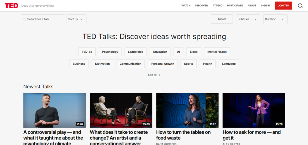
The TED website exemplifies effective chunking by categorizing talks into various categories with tabs and provides concise descriptions. This organization helps users quickly find and explore content relevant to their interests without feeling overwhelmed by the sheer volume of available talks.
Feedback Loops
Feedback loops are crucial for reinforcing user behavior by providing real-time information about their actions. Effective feedback loops enhance user satisfaction by providing an immediate confirmation. They keep the users aware of their status in the application and promote continued use by reinforcing positive behaviors and helping users stay on track.
Some applications of Feedback Loops in Interface Design:
- Immediate Feedback: Providing instant responses to user actions, such as confirmation messages, success animations, or error indicators, helps users understand the result of their actions. For example, after submitting a form, a confirmation message lets users know that their submission was successful.
- Regular Updates: Sending notifications or reminders can re-engage the users and encourage ongoing interaction. For example, a fitness app might send notifications about daily step goals or reminders to complete a workout, keeping users engaged with their fitness journey.
Real-Life Example:
Fitbit utilizes feedback loops effectively by providing real-time updates on users’ fitness progress, including daily steps, burnt calories, and the overall progress towards goals. This continuous feedback helps users stay motivated and engaged with their fitness routine.

Anchoring
Anchoring is a cognitive bias where individuals rely heavily on the first piece of information they encounter or the “anchor” when making decisions. Anchoring can enhance user decision-making, drive higher sales, and increase the perceived value of products or services. By strategically positioning information while designing interfaces, designers can guide the users towards choices that benefit both them and the business.
Some applications of Anchoring in Interface Design:
- Pricing Strategies: Presenting the priciest option first can make subsequent choices appear more affordable by comparison. For example, showing a high-priced subscription plan before listing more affordable options can make the latter seem like a better deal.
- Value Proposition: Highlighting the most valuable features or benefits upfront sets a high expectation for the product. This makes the other options or features comparatively more attractive.
- Option Framing: Arranging choices in a way that emphasizes the most popular or recommended option can guide users towards preferred selections.
Real-Life Example:
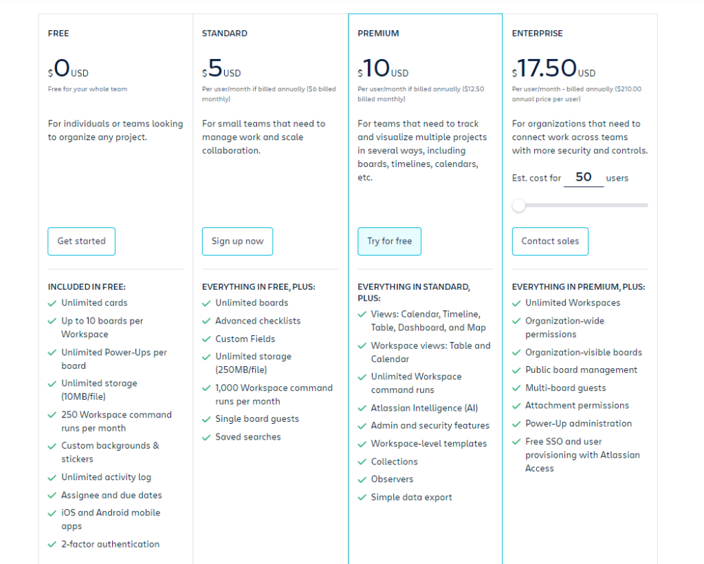
Trello uses anchoring by displaying its free plan first, followed by Standard, Premium (highlighted and also given a free trial option), and Enterprise. This setup makes the Premium plan seem like the best value when compared to the lower-priced Standard and free options. The Enterprise plan, listed last at a much higher price, further reinforces the appeal of the mid-tier Premium plan, subtly guiding users toward it.
Choice Architecture
Choice architecture in Behavioral UX refers to the way options are presented to users, influencing their decisions and guiding them toward desired actions. By carefully structuring the layout, labelling, and hierarchy of choices, designers can simplify decision-making and reduce cognitive load. This approach ensures that users make informed, beneficial decisions without feeling overwhelmed. Thoughtful choice architecture can increase conversions, user satisfaction, and help avoid analysis paralysis by presenting the right balance of options in an intuitive and user-friendly manner.
Some applications of Choice Architecture in Interface Design:
- Default Settings: Pre-selecting the most beneficial or popular options can streamline the user experience and guide users to make optimal choices without overwhelming them with too many decisions.
- Option Framing: Presenting options in a way that emphasizes the most desirable choices can influence user decisions. For example, highlighting “most popular” or “best value” options can make them more appealing.
- Simplified Decision-Making: Reducing the number of choices can prevent decision fatigue. Offering a curated set of options that align with user needs is more effective.
Real-Life Example:
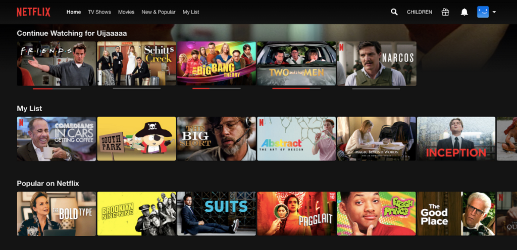
Netflix applies choice architecture in its sections like “Continue Watching” and “Popular on Netflix”. By placing these curated lists at the top of the user’s homepage, Netflix reduces the effort required to decide what to watch. Instead of overwhelming users with a lengthy catalogue, it prioritizes personalized suggestions and recently watched content, simplifying the decision-making process. This layout helps users make quick choices and keeps them engaged without browsing endlessly through endless options.
Conclusion & Final Thoughts
As the digital landscape evolves, understanding and applying behavioral principles in UX design is extremely important. By considering how users think, feel, and behave, designers can create interfaces that not only meet users’ needs but also exceed their expectations. Incorporating these principles will make your interfaces more effective and help you stand out in a competitive market and create meaningful experiences.


